This documentation will provide you with all the information regarding adding a button block to customization options. So, let’s get started.
Video Tutorial
Here’s a video tutorial to add WordPress Button to your website.
Step 1: Install PostX Plugin
Before getting started, you need to install and activate the PostX Plugin.
Step 2: Add PostX Button Block
Now that you have installed and activated the PostX plugin, you can add the PostX Button Block to your WordPress page.
Here’s how:
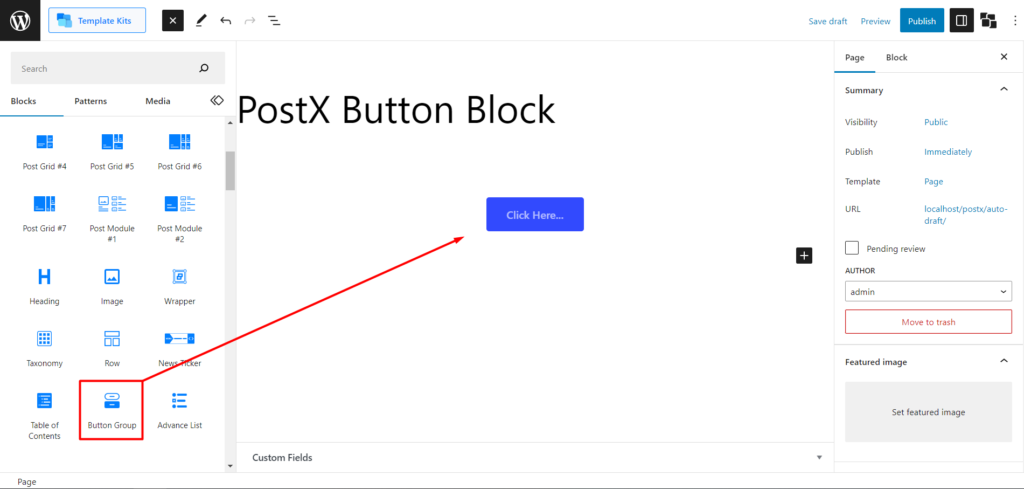
- Go to the page where you want to add the button.
- Click on “Add Block” or the “+” icon to add a new block.
- In the search bar, type “Button Group” and select the PostX Button Block.
- The PostX Button Block will be added to your page.
Step 3: Add Links in WordPress Buttons
Start by clicking on the button and selecting the text you want to add a link to. This action will display the default WordPress tooltip. In the tooltip, you will find the “Link” option represented by a hyperlink icon. Click on this option to open the URL box to input your desired link.
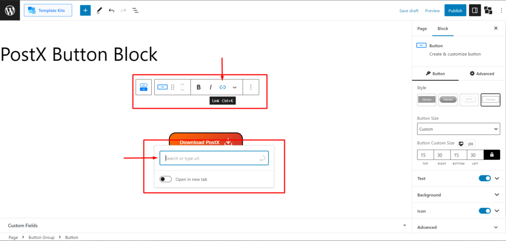
Within the URL box, enter the URL or web address to which you want the button to redirect when clicked. Ensure to include the full link, including the “http://” or “https://” prefix. Once you’ve entered the URL, confirm the link by pressing the “Enter” key or clicking outside the URL box. The link will now be associated with the button.
Step 4: Customize the Button Block
Customizing the button block allows you to personalize its appearance and behavior. Follow these steps to unleash the full potential of the PostX Button Block:
Selecting Button Settings
Click on the button you want to customize within the Button Block. This will activate the customization options for that specific button.
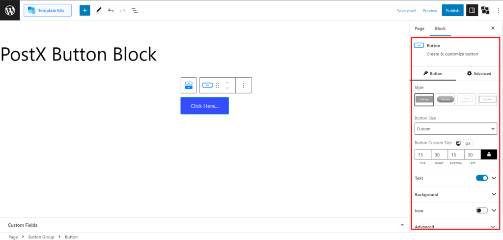
Style
In the right sidebar, locate the “Style” section. Choose from a variety of pre-designed button styles to find the one that suits your website’s design.
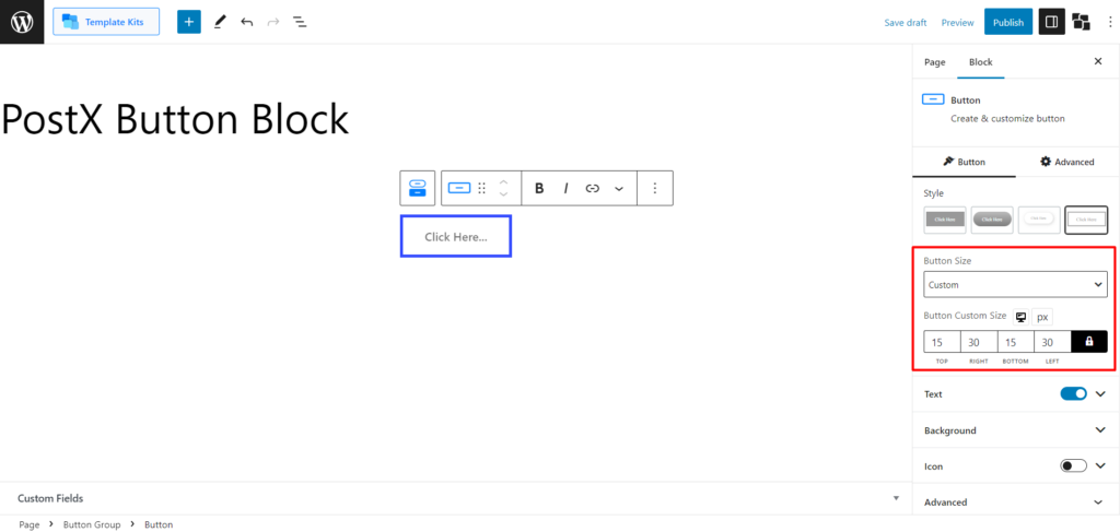
Button Size
In the right sidebar, find the “Button Size” section. Select a predefined button size: Small, Medium, Large, or Extra Large.
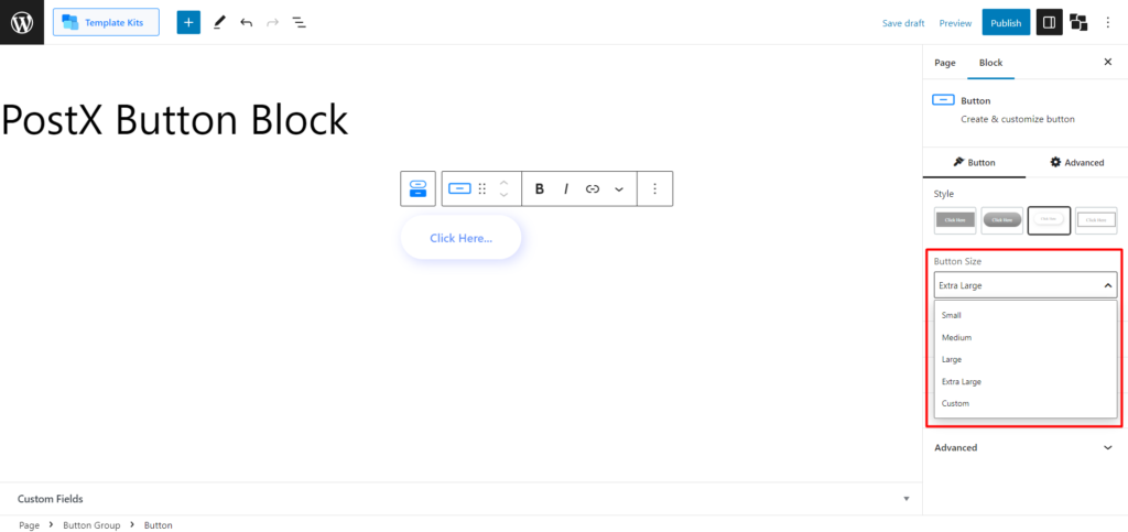
Alternatively, choose “Custom” to define your own button size by adjusting the horizontal and vertical measurements.
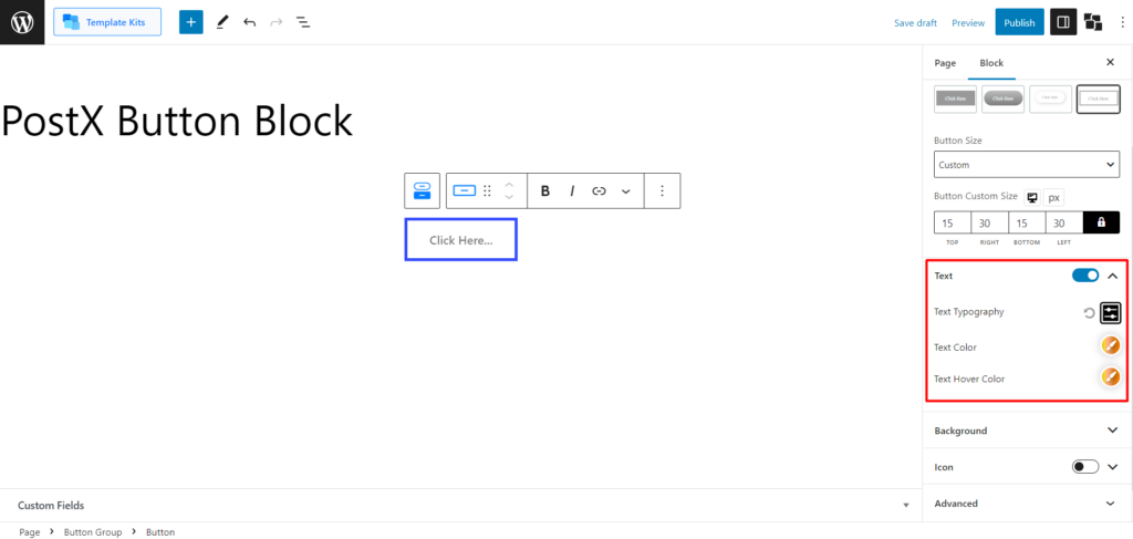
Text
In the right sidebar, locate the “Text” section. Customize the button text by adjusting the typography, color, and hover color.
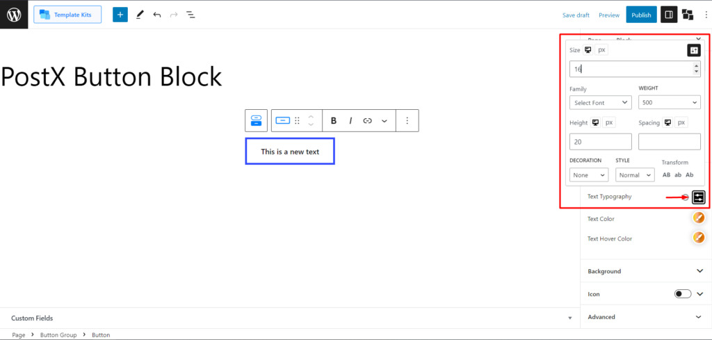
Use the “Text Typography” option to modify font size, select fonts (including custom fonts), font weight, letter spacing, and more.
Adjust the “Text Color” and “Text Hover Color” to achieve the desired text appearance and effects.
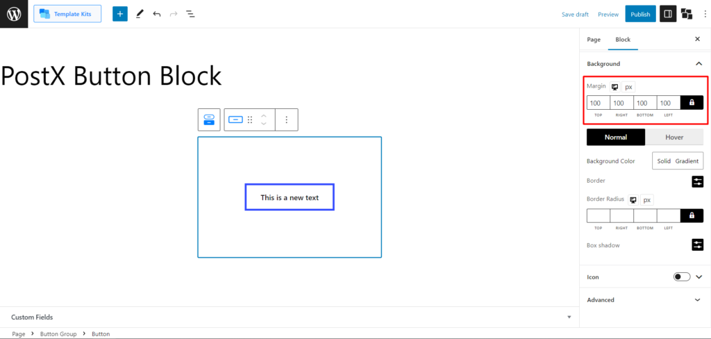
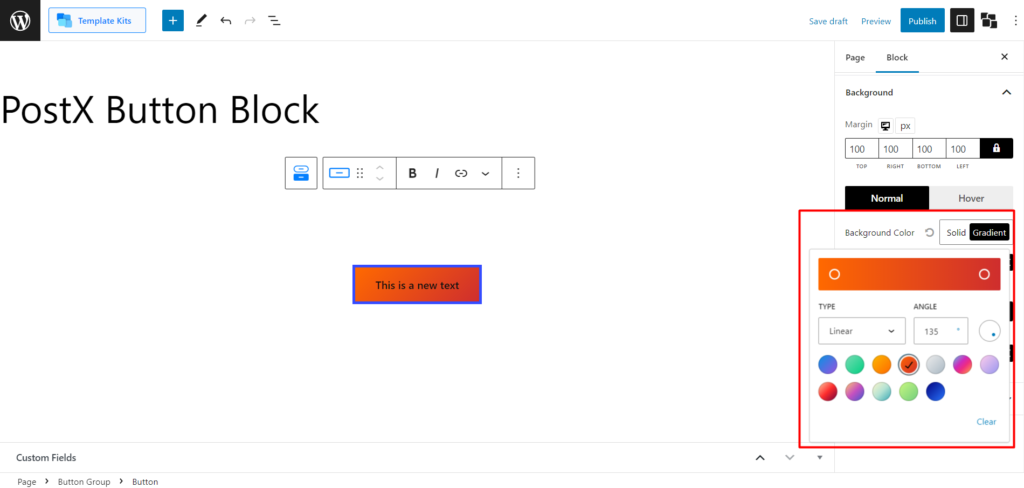
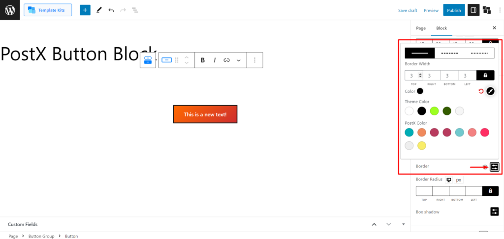
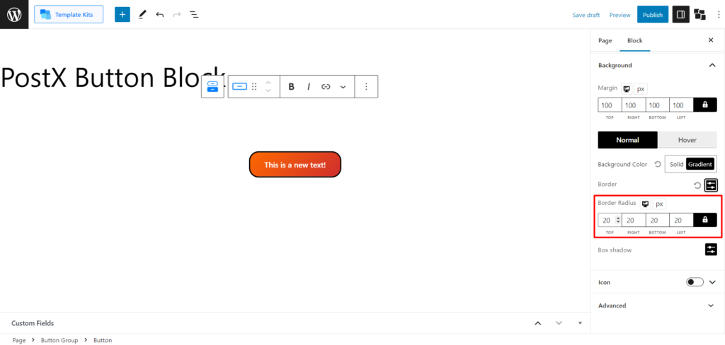
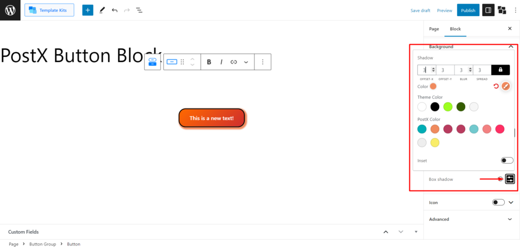
Background
In the right sidebar, find the “Background” section.
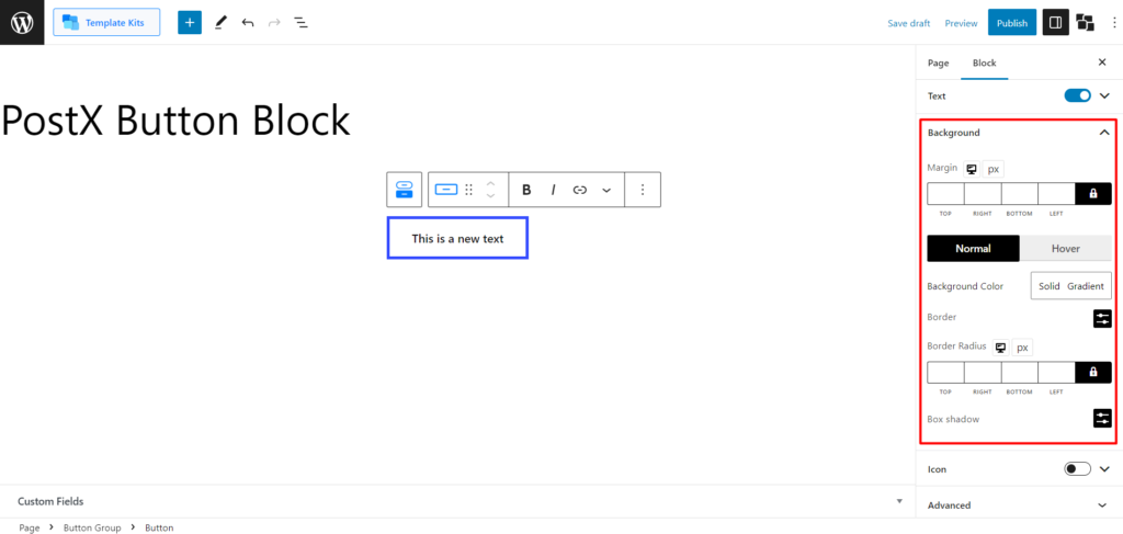
Set the button margin to control its horizontal and vertical placement.
Choose a solid color or create a gradient background for the button.
Adjust the border style, width, and color.
Customize the border-radius to determine the roundness of the button’s corners.
Optionally, apply a box shadow with customizable offset, blur, spread, and color settings.
Here’s how the hover effect looks:
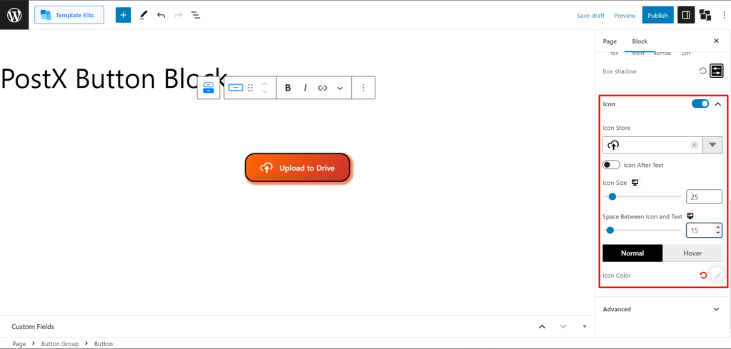
Icon
In the right sidebar, locate the “Icon” section. Enable the icon toggle bar to incorporate an icon into your button. You can select an icon from the vast library available.
Choose whether the icon should appear before or after the button text.
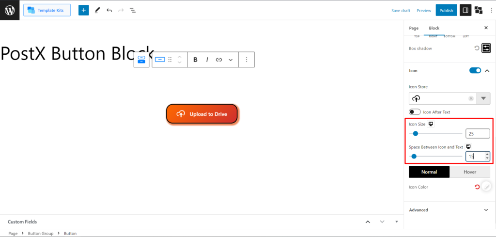
Adjust the icon size and the space between the icon and the text.
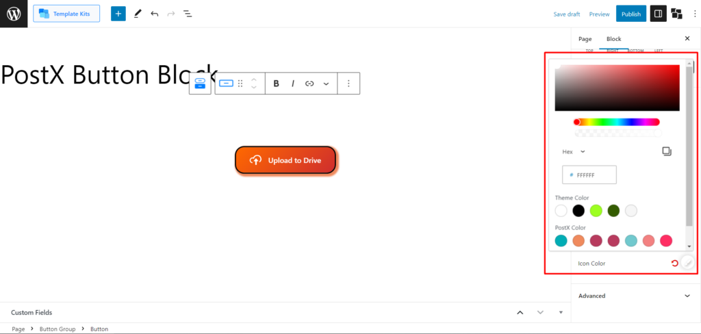
Modify the icon color and hover color to match your design scheme.
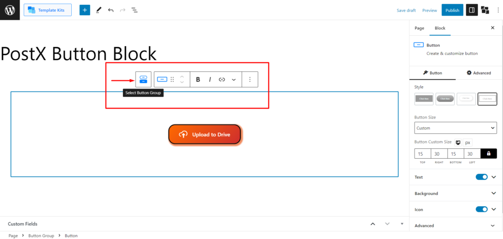
Selecting Button Group Settings
To customize the entire button group, click on the “Select Button Group” icon in the default WordPress Tooltip.
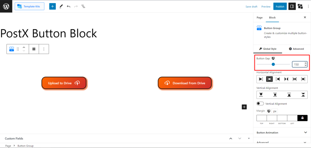
Button Gap
Adjust the button gap to control the spacing between multiple buttons in the group.
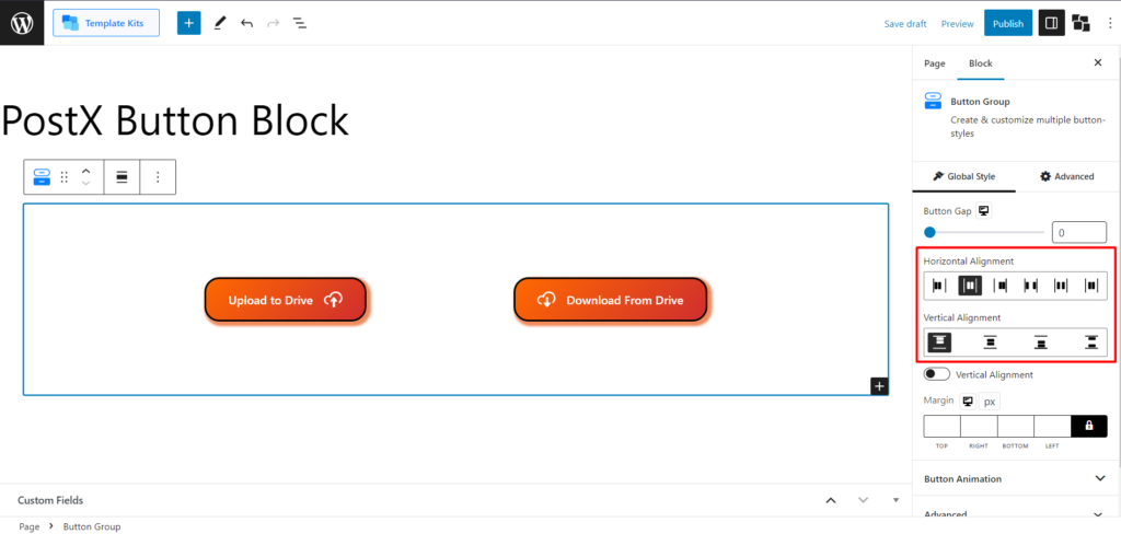
Alignment Adjustments
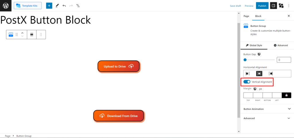
Align the buttons horizontally or vertically within the group using the alignment options. This will help to fine-tune the margin of the entire button group for precise placement.
Easily toggle for vertical button placement.
Button Animation
Apply button animations to create dynamic user experiences. Choose from available animation styles and adjust the animation position using the Button Transformation slider.
Publish or Update
Take a moment to review your customizations for the button block. Make any additional adjustments as needed. Click the “Update” button to save your changes if you are editing an existing page. If you are creating a new page, click the “Publish” button to make the changes live on your WordPress website.
Congratulations! You have successfully customized the PostX Button Block, allowing you to create visually appealing and interactive buttons that enhance the user experience on your website.